User flowchart
Figure 1 outlines a typical user workflow, divided into: (i) preparation, (ii) ranking, (iii) plotting, and (iv) other features. Steps (i) to (iii) are common to both the CLI and Web App UI, while (iv) utilizes the CLI utilities. Additional details, including versions, programming languages, documentation links, and brief descriptions, are provided in Additional file 2: Tab. ST2.
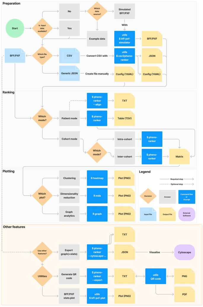
Flowchart of the available options in the Pheno-Ranker toolkit. ‘Preparation,’ ‘Ranking,’ and ‘Plotting’ can be performed using both the CLI and UI, while ‘Other Features’ are exclusive to the CLI. For more information, refer to the online documentation and Supporting Table 2
User interface
We provide a web application (playground accessible at [62]) that offers a user-friendly interface, integrating Pheno-Ranker’s various command-line functionalities. A shared demo account is available for testing. For users working with sensitive data, secure access is provided through ORCID iD login. Returning users can quickly access the two ranking modes—cohort and patient—while new users can follow the interactive decision tree for guidance (see Fig. 2a).
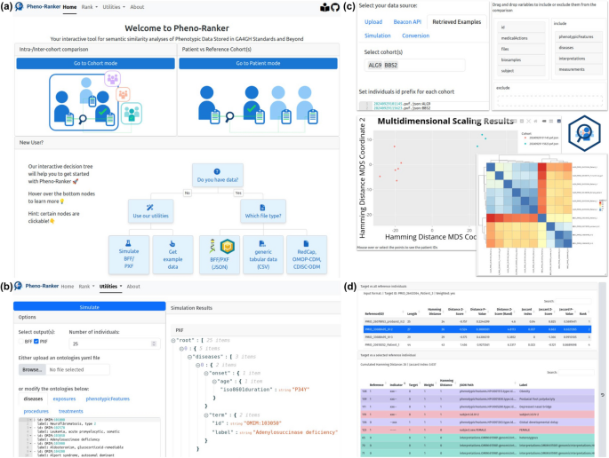
Screenshots of Pheno-Ranker User Interface. a Landing page, where returning users can access ranking modes, while new users can follow the interactive decision tree. b Utility for simulating synthetic patient data, customizable with user-defined ontologies. c Cohort mode settings and output: Individuals can be uploaded or retrieved from Pheno-Ranker-UI’s utilities. Top-level terms (e.g., phenotypicFeatures, diseases, interpretations,…) can be selected via drag-and-drop. Results are displayed as a heatmap or multidimensional scaling matrix scatter plot. These elements are also available in patient mode. d Tabular output of patient mode, showing differences between two individuals. The top table serves as a selector for the bottom table, which provides a one-to-one comparison of the target and reference patient (highlighted in blue). Rows are colored by top-level terms for clarity
Users can: (i) upload their own data in BFF, PXF, or CSV format leveraging the csv2pheno-ranker tool, which converts it into a Pheno-Ranker-compatible format, (ii) select simulated data obtained from the built-in bff-pxf-simulator (see Fig. 2b), (iii) use example data from a Phenopackets corpus [77] (see Fig. 2c), and, (iv) employ data directly queried from Beacon v2 APIs (record granularity) [52]. The UI output will vary depending on whether it is in cohort mode or in patient mode. In both modes, the software generates a variety of results such as heatmaps (with clusters) [78], dimensionality reduction plots [58, 75, 79] and graph-based plots [60, 80, 81] (see Fig. 2c). To the patient mode exclusive is the output of HTML tables (Fig. 2d) such as an alignment resembling that in BLAST [82]. A settings bar allows users to select datasets, define patient ID prefixes, and configure advanced options such as weighting variables and excluding specific terms via a drag-and-drop interface. Each utility and ranking mode includes a history sidebar for users to revisit, rename, or delete past runs, which are stored for at least 30 days.
Simulated datasets
Our initial experiment aimed to validate Pheno-Ranker’s capability to handle the variability of information present in BFF files (JSON data structures). We created 10 and 100 completely random individuals by selecting 10 diseases, exposures, phenotypicFeatures, procedures and treatments (shuffled from pools of 100). Apart from the previous 50 properties, each individual was randomly assigned a biological sex (male or female) and a ethnicity. As shown in Additional File 1: Fig. SF5a and SF5c, which depict heatmaps of pairwise Hamming distances between all individuals in the cohort, the diagonal elements represent perfect matches (self-matches). The non-diagonal elements show distances ranging from 82 to 104, with a mean of 93.9 and a standard deviation of 4.3 for 10 individuals (see Additional File 1: Fig. SF4b), and from 74 to 106, with a mean of 94.2 and a standard deviation of 4.3 for 100 individuals (see Additional File 1: Fig. SF4d). These values are representative of a lower bound similarity (or similarity for a random model) using these number of variables. We used 10 and 100 individuals to show that the behavior is consistent, regardless of the number of individuals.
The second experiment was designed to show the power of Pheno-Ranker for recognizing patterns in a cohort. For this purpose, we created 100 individuals, but this time, each individual had exactly 1 phenotypicFeatures, 1 diseases, and 1 treatments that were randomly selected from pools of 2 (note that the features, diseases and treatments chosen are irrelevant, they just serve for demonstration purposes), along with sex and ethnicity. When we only included phenotypicFeatures, the heatmap depicted two clusters, consisting of the two features from the pool (see Fig. 3a). When we repeat the analysis but this time including sex, the 2 clusters became 4 as the two phenotypicFeatures were spread equally among the females and males (see Fig. 3b). Continuing with this, we then included diseases on the analysis, and we got 8 clusters (see Fig. 3c). Finally, we included the treatments and we obtained 16 clusters (see Fig. 3d).
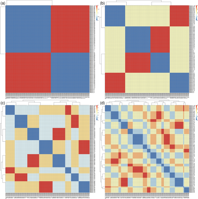
Heatmaps and clusters generated using Pheno-Ranker from simulated Beacon v2 data (individuals entity), based on pairwise Hamming distances between individuals. The dataset comprises 100 individuals, each with 1 phenotypicFeatures, 1 disease, and 1 treatment, randomly selected from a pool of two, along with their sex and ethnicity. a The heatmap shows two clusters when only phenotypic features are considered, representing the two distinct features in the pool. b By including sex, the clusters increase to four, distributing the two phenotypic features across both sexes. c Adding diseases to the analysis results in eight clusters. d Finally, incorporating treatments leads to a total of 16 clusters. Figure results can be reproduced by using the commands at [76]
The third experiment aimed to demonstrate the effectiveness of assigning weights to variables. We simulated a cohort of 100 individuals, each with 2 phenotypicMeasures, 2 diseases, and 2 treatments, chosen from pools of 5, along with sex and ethnicity. In Additional file 1: Fig. SF5a we display the results when only including phenotypicFeatures, diseases and treatments. In Additional file 1: Fig. SF5b we include a weights file to the calculation, giving the variable ‘Caucasian’ a weight of 10. In Additional file 1: Fig. SF5c we also added the variable ‘RxNorm:1,000,000’ (Tribenzor) with a weight of 5. Finally, in Additional file 1: Fig. SF5d we display multidimensional data scaling on data from Additional file 1: Fig. SF5c.
The fourth experiment aimed to assess the ability to stratify patients in situations where data are incomplete or missing, a common issue in real-world datasets. We created two small cohorts of 10 individuals each to ensure labels remained visible in the plots. The first cohort consisted of individuals with a single disease (disease A), while the second cohort included individuals with two diseases, selected from a pool of five (A, B, C, D, and E). This approach generated C(5,2) = 10 unique combinations of two diseases, with disease A pairing with B, C, D, or E to form combinations like AB, AC, AD, and AE. Repetitions of features were not allowed. For a sufficiently large cohort, 40% of individuals in the second cohort were expected to carry disease A. In our sample, only ‘Beacon_7’ (female) and ‘Beacon_10’ (male) from the second cohort had disease A. These two individuals clustered with the first cohort, as shown in Additional File 1: Fig. SF6a, where only diseases term was considered. As expected, when the term sex was included, the number of clusters doubled (Additional File 1: Fig. SF6b). Recalculating using the Jaccard similarity index yielded the same results (Additional File 1: Fig. SF6c and SF6d).
The previous results demonstrate Pheno-Ranker’s effectiveness in cohort mode for classification. Additionally, its patient mode allows for comparing a single patient’s data against one or more cohorts, providing various metrics to evaluate the significance of these matches. To evaluate the robustness, and continuing with simulated data, we created a patient consisting of exactly 2 phenotypicFeatures sampled from a pool of 25. The reference cohort, comprising 1000 individuals, was created similarly. This setup yields a match probability of ~ 3 individuals, calculated as 1000 / C(25,2). In Table 1 we display the results for the first 10 matches. In this experiment, when including only phenotypicFeatures in the calculation, our patient got an exact match (distance = 0) with 3 individuals from the simulated reference cohort (Beacon_154, Beacon_444 and Beacon_697). As expected, the distances ranged from 0 (perfect match) to 4 (differences on each position of the 4-character vector) with a mean of 3.85 and a standard deviation of 0.36. To build on this experiment, we generated a new patient and a reference cohort of 1000 individuals, each with 3 phenotypicFeatures, 3 diseases, and 3 treatments chosen from pools of 5. The results, shown in Table 2, revealed an exact match for the new patient with two individuals in the cohort (Beacon_121 and Beacon_49), sharing all variables (9 out of 15 possible), resulting in a Z-score of − 3.38. This run highlights the Z-score metric’s stringency, as matches with a distance equal to 2 (which still have 8 matches) were not deemed significant. It is important to note that the Z-score’s significance is expected to be more pronounced with real data, which typically does not have perfect matches.
Synthetic dataset
Next, we used the synthetic data from the ‘CINECA_synthetic_cohort_EUROPE_UK1’ dataset (see Implementation section, Dataset II), which consists of 2504 individuals. The purpose of this test was to check whether Pheno-Ranker was able to handle a dataset that is regularly used to debug Beacon v2 API deployments [65]. We performed calculations in cohort mode, including the terms sex and ethnicity and we gave a weight of 3 to the term sex that included variables ‘sex.id.NCIT:C20197’ and ‘sex.id.NCIT:C16576’: In Fig. 4a we display the heatmap according to Hamming distance (dissimilarity) and Fig. 4b according to Jaccard index (similarity). Note that both metrics yield similar yet complementary results.
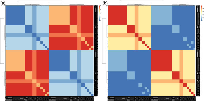
Heatmaps and clusters generated using Pheno-Ranker from synthetic Beacon v2 data (individuals entity), based on pairwise Hamming distances between individuals. The synthetic dataset ‘CINECA_synthetic_cohort_EUROPE_UK1’ includes 2504 individuals, with terms sex and ethnicity incorporated, and weights of 3 assigned to sex. a Displays the heatmap based on Hamming distance, reflecting dissimilarity among individuals. b Shows the heatmap according to the Jaccard index, highlighting similarities. Figure results can be reproduced by using the commands at [76]
Use case—PRECISESADS dataset
In the previous sections, Pheno-Ranker has undergone extensive testing with simulated and synthetic datasets. However, it is important to acknowledge that such datasets may not fully encompass the variability present in real-world data, as they often contain a consistent number of variables, unlike the more complex and variable data typically encountered in clinical trials. Therefore, we conducted an analysis on the PRECISESADS clinical records to demonstrate the utility of the tool with a real-world dataset. The analyses were performed by incorporating all available information from the PRECISESADS cohort, with non-informative values (e.g., unknown, missing) replaced by ‘NA’ (i.e., Not Available).
With the cohort mode, we aimed to identify hidden potential confounders and/or clinical features that might differentiate between patients. As anticipated, most clinical features and comorbidities were absent in healthy controls, consistent with the definition of healthy control recruitment, resulting in a distinct cluster separate from the patients (Fig. 5a). SADs are known to share phenotypic commonalities, reflected in a single cluster, but with a more dispersed distribution than that of healthy controls. Notably, two diseases, SSc and SLE, stood out from the other five, distributed in the upper and lower parts of the SADs clusters (Fig. 5a).
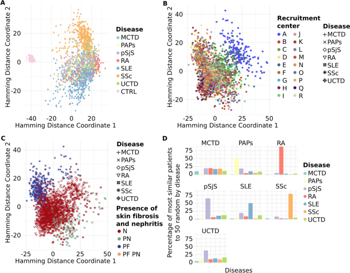
Pheno-Ranker’s analysis of the PRECISESADS dataset involves 7 disease-specific cohorts and 1 control cohort. Figures a–c showcase plots generated through multidimensional data scaling (MDS) applied to the distance matrix from an inter-cohort (cohort mode) analysis. Specifically, a demonstrates the MDS of the 8 cohorts, including the control, with each cohort colored differently; b presents the MDS plot of the 7 diseases, differentiated by research center and symbolized for each disease; and c shows the MDS plot of the 7 diseases, highlighted by the presence of skin fibrosis and nephritis. Figure d illustrates the Pheno-Ranker’s performance on patient mode, revealing the percentage of the most similar patients (from all diseases) to 50 randomly selected patients for each disease
To further investigate the characteristics distinguishing SADs patients, cohort mode was rerun excluding the healthy controls, and ANOVA analyses were conducted between MDS dimensions and each included variable (see Additional file 5 and R script file [76]). The primary variable associated with both MDS dimensions was the recruitment center. This was reflected in the position of center ‘A’ in the SADs cluster during dimensional reduction analysis (Fig. 5b). A detailed examination of the variables revealed that center ‘A’ exhibited the highest proportion of missing values (data not shown), potentially explaining the observed difference. Subsequently, the next two variables most strongly associated with the MDS dimensions were the presence of skin fibrosis, a hallmark of SSc [83], and the presence of nephritis, a major and quite specific clinical complication in SLE patients [84]. These findings elucidated the separation of these two diseases from the rest of the SADs (Fig. 5c).
Finally, we applied Pheno-Ranker in patient mode to evaluate its patient-matching capabilities. Figure 5d displays the percentage of patients most similar to 50 randomly chosen individuals from each disease group. Notably, Pheno-Ranker reliably identified similarities across various diseases. Yet, it faced difficulties with Mixed Connective Tissue Disease (MCTD) and Undifferentiated Connective Tissue Disease (UCTD) due to the shared phenotypic features with other conditions.
Features, capabilities, and limitations
Coding schemes like HPO or OMIM terms have greatly enhanced genomic and phenotypic data analysis. Their use boosts semantic similarity analysis, making it easier to identify related terms and concepts, thus enriching our data understanding. To compare phenotypic data encoded in these schemes, various methods have emerged, including text-based comparisons and analyses of term relationships from ontology structures [4, 10, 18,19,20,21,22,23,24,25,26,27,28,29,30,31,32,33,34,35,36].
Here, we present Pheno-Ranker, an innovative approach that extends beyond the constraints of tools dependent on pre-selected ontologies. We want to clarify that Pheno-Ranker is not intended to outperform these types of tools. If a researcher wants to compare individuals based on HPO terms (or others such as OMIM, SNOMED CT, etc.), Pheno-Ranker’s only strength lies in its ability to directly process BFF or PXF data exchange formats, eliminating the need for data conversions. Rather, its uniqueness lies in the versatility and detail it offers; it is compatible with any standardized terminology leading to more nuanced and flexible outcomes. Pheno-Ranker handles data in JSON/YAML formats, first flattening the data to 1D lookup tables and then converting them into binary digit strings. This conversion conserves data context and streamlines efficient similarity matching, also ensuring compatibility with machine learning algorithms. To our knowledge, Pheno-Ranker is the first tool to directly perform similarity calculations on two GA4GH standards, making it particularly suitable for patient matching (matchmaking) and stratification in GA4GH-compliant data repositories. The software can be configured to work with other health data standards, like OpenEHR [85], as shown in the example at the online documentation [56]. Additionally, in conjunction with our Convert-Pheno tool [86], it supports data from other clinical data models such as the Observational Medical Outcomes Partnership Common Data Model (OMOP CDM), ensuring compatibility with various health data ecosystems.
Pheno-Ranker includes a suite of utilities, significantly broadening its use beyond YAML or JSON hierarchical data formats. Firstly, bff-pxf-plot is a tool developed to create summary statistics plots as PNG images for BFF and PXF formats (see Additional file 1: Fig. SF7 and online documentation [56]). Secondly, bff-pxf-simulator is designed to generate simulated data in BFF/PXF exchange formats, addressing the scarcity of synthetic or simulated datasets for Beacon v2 and Phenopackets v2 in the literature [87, 88]. Our simulated data are versatile, serving purposes ranging from technical, like testing Beacon v2 implementations [65], to scientific, such as creating “control” cases for outlier detection. Thirdly, the csv2pheno-ranker utility enables converting CSV files into a format compatible with Pheno-Ranker. This expands the scope of analysis, for example, enabling comparison of samples in a multi-sample VCF based on their “genomic fingerprint”, as shown in our documentation [56]. Fourthly, we offer a set of utilities for encoding/decoding the binary vector into QR codes (PNG images) plus generating PDF reports (see Additional file 1: Fig. SF8 and examples at the documentation [56]). This concept aligns with the health passports [89] that store patient information in barcodes (i.e., those used to encode in COVID-19 vaccination state). Pheno-Ranker efficiently condenses data by directly encoding binary vectors into QR codes, enhancing the capacity for storage of variables within the code. Although currently a proof of concept, our solution could be applied to health data transfer, especially with the implementation of proper security measures, such as data encryption [8]. Other futuristic applications could be patient enrolment in clinical trials or “wireless” similarity matching via a Pheno-Ranker mobile app.
The simplicity of our algorithm makes it suitable for personalized implementations, allowing users to store the one-hot encoded data in a database for efficient comparisons using for instance SQL functions or vector databases. The Pheno-Ranker algorithm could easily be implemented in a federated network, such as Beacon v2 networks (see explanation at Additional file 6). This approach holds promise for collaborative research, such as hospital networks, aiming to find similar patients across different institutions.
One limitation of Pheno-Ranker is its handling of continuous data, such as age or numerical measurements. For age data, both the Beacon v2 and Phenopackets v2 schemas allow the use of ranges instead of specific ages, which enhances privacy. For other continuous variables, we recommend using ranges or pre-processing them into bins/categories whenever possible. Cautious handling of continuous data is essential, depending on the research goals and the nature of the data.
Another limitation of our method is its lack of terminology-matching capability, meaning that variables describing identical concepts across different standardized vocabularies are not recognized as matches. This limitation arises not from a flaw in our approach, but rather from the lack of prescribed ontologies within the Beacon v2 and Phenopacket v2 schemas. Additionally, our method currently supports only exact matches, excluding the possibility of fuzzy searches. Despite these challenges, the rapidly advancing field of ontology mapping, coupled with the ongoing progress in natural language processing (NLP), holds promise for overcoming these limitations soon.
Pheno-Ranker has been rigorously tested using a variety of simulated and synthetic datasets. However, these datasets may not encompass the full variability found in real-world data, like that from clinical trials. To address this, we also analyzed data from the PRECISESADS project, which enabled us to stratify diseases by their unique characteristics, identify outliers, and match patients with the same disease across the entire dataset.
It is important to note, though, that in case–control comparisons, the number of variables between groups can skew similarity measures. The Hamming distance may be artificially higher for cases with more variables, requiring normalization or a focus on shared variables. The Jaccard index, while less impacted, can underestimate similarity in cases with many additional variables. Addressing this bias involves selecting key variables, considering data imputation for missing values, and performing sensitivity analyses. Expert input is vital for including/excluding relevant variables and validating results. Pheno-Ranker’s ability to tailor analysis to key traits demonstrates its capacity for delivering valuable insights from complex datasets.
Data security and privacy are crucial when deploying Pheno-Ranker. Each center is responsible for maintaining the confidentiality, integrity, and availability of their data, and must implement appropriate safeguards to protect sensitive information.
At CNAG, we are preparing to assess Pheno-Ranker’s effectiveness with PXF data from the Genome-Phenome Analysis Platform [90], and exploring its capabilities in federated analysis contexts (refer to the Additional file 6). In the broader scope of Pheno-Ranker’s capabilities, its applicability is not just confined to genomic and phenotypic data. It can be effectively adapted for use with diverse JSON or CSV datasets, provided an appropriate configuration file is used. This feature significantly widens the range of potential applications, enabling researchers to investigate semantic similarities in various fields.
In conclusion, Pheno-Ranker is a versatile and powerful tool for individual-level comparison of pheno-clinical data. By uncovering hidden patterns and relationships, Pheno-Ranker has the potential to advance personalized medicine, disease classification, and scientific discovery. We look forward to further developments and real-world applications of Pheno-Ranker, leveraging its capabilities to drive progress in genomics and beyond.
